Ever stared at a prescription bottle and felt like you’re decoding a secret code? You’re not alone. Pharmacy labels and warning stickers are meant to keep you safe-but too often, they do the opposite. Small fonts, confusing symbols, and mismatched colors make it hard to know what you’re taking, when, and why. With new rules rolling out in 2025, things are changing. But right now, understanding what’s on your label could prevent a dangerous mistake.
What’s Actually Required on Your Prescription Label?
By law, every prescription label in the U.S. must include your name, the drug name, the dosage, and how often to take it. That’s the bare minimum. Everything else? It’s a patchwork. One pharmacy might print a bright orange warning sticker for opioids. Another might use a tiny gray note buried under the directions. The FDA doesn’t require those extra warnings-states do. And that’s where things get messy.
Connecticut made headlines in January 2024 by mandating fluorescent orange warning labels, exactly 1.25 inches in diameter, on every opioid prescription. That sticker isn’t optional. It’s the law. But in Texas, the same drug might come with no warning at all-unless the pharmacist added one voluntarily. The FDA is trying to fix this. Their new Patient Medication Information (PMI) rule, set to launch in early 2025, will require every pharmacy to use a single, standardized format. Think of it like a universal instruction manual for your pills.
Warning Stickers: What the Colors and Symbols Mean
Not all warning stickers are created equal. But there are common patterns you can learn.
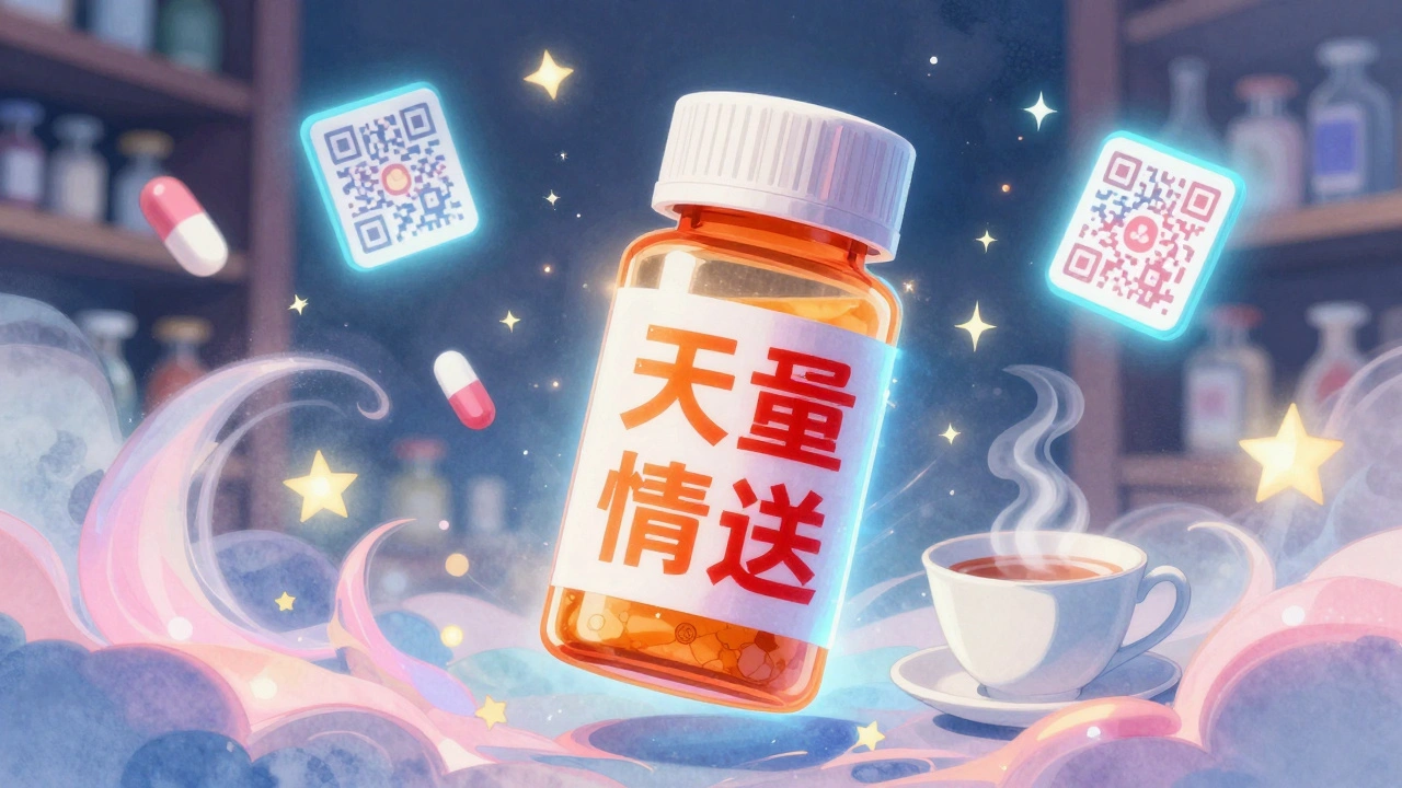
- Fluorescent orange = High-risk drug, often opioids. This is now mandatory in Connecticut and 26 other states. It’s meant to catch your eye-no matter your vision.
- Red with white text = Serious risk: overdose, addiction, or life-threatening interactions. PDC Healthcare’s standard opioid warning label measures 1-9/16" x 3/8" and uses this color combo because it’s proven to stand out.
- Yellow = Caution: possible side effects, interactions with food or other meds. Often used for blood thinners or diabetes drugs.
- Blue or green = Informational, not urgent. Might say "Take with food" or "Avoid alcohol." These are helpful, but not safety-critical.
Some labels now include QR codes. Scan one with your phone, and you might get a short video showing how to take the pill correctly. That’s still rare-only about 18% of labels have them-but it’s growing fast. The goal? Replace confusing text with something you can actually understand.
Font, Color, and Contrast: Why Your Label Looks So Hard to Read
It’s not just what’s written-it’s how it’s written. For years, pharmacies used tiny, serif fonts on light backgrounds. Bad idea. A 2023 AARP survey found 68% of adults over 65 struggled to read their prescription labels. The FDA’s new rules fix this.
By 2025, all essential info must use a sans-serif font (like Arial or Helvetica), at least 6-point size. Warnings? Must be 8-point or larger. Background and text must have a contrast ratio of at least 4.5:1. That means dark text on white or light yellow. No more gray-on-beige. No more italics. No more fancy fonts.
Why does this matter? Because if you can’t read it, you won’t take it right. One Reddit user, PharmTech42, shared that three patients this year confused their blood pressure pill with their diabetes pill-because the labels looked nearly identical. That’s not a coincidence. It’s a design failure.
Barcodes and Scans: The Hidden Safety Net
Every prescription label now has a barcode. Not just any barcode-it’s a GS1 DataMatrix or Code 128, encoding your drug’s National Drug Code (NDC), lot number, and expiration date. Pharmacies scan these before giving you the bottle. Why? To catch errors before they happen.
Barcode systems check three things: Is this the right drug for your name? Is the dosage correct? Is the warning sticker present and legible? If something’s off, the system flags it. This isn’t optional anymore. The FDA requires it. And it’s already cutting errors by up to 20% in pharmacies that use it properly.
But here’s the catch: Not all pharmacies have the right scanners. Small independent shops might still be using outdated equipment. That’s why the FDA estimates 95% of U.S. pharmacies will need to upgrade by 2025. It’s expensive-$5,000 to $15,000 per pharmacy-but it’s saving lives.
Language Barriers and the Push for Multilingual Labels
Over 47% of Limited English Proficiency (LEP) patients say they don’t understand their prescription labels, according to California’s 2021 survey. That’s not just inconvenient-it’s dangerous. That’s why California now requires multilingual labels on all prescriptions. Spanish, Chinese, Vietnamese, Tagalog, and Korean translations are printed right on the label.
Other states are watching. New York and Illinois are testing similar rules. The FDA’s new PMI format will include standardized translations for key phrases: "Take once daily," "Do not drink alcohol," "May cause dizziness." No more guessing. No more relying on a family member to translate.
And it’s not just about words. Symbols are being tested too. A red circle with a slash through a wine glass? That means "no alcohol." A clock with arrows? "Take at the same time every day." These icons work across languages.
What’s Changing in 2025-and What You Should Do Now
The big shift is coming: the FDA’s Patient Medication Information (PMI) rule. By January 1, 2025, every prescription label in the U.S. will follow the same layout:
- Drug name and strength (big, bold, easy to read)
- How to take it (clear steps: "Take one tablet by mouth with water once daily")
- Why you’re taking it ("For high blood pressure")
- Key warnings (in red, with icons if needed)
- When to call your doctor
- Storage instructions
No more buried warnings. No more jargon like "q.d." or "p.o." Everything will be in plain English.
What should you do now? Don’t wait for 2025. Start reading your labels like a detective:
- Check the font size. If you need glasses to read it, ask for a larger print copy.
- Look for color. Orange or red? That’s a red flag-ask your pharmacist what it means.
- Scan the barcode with your phone. If you get a website, check if it’s official (look for .gov or .org).
- Ask: "Is there a written warning for this drug?" Many pharmacists will give you a printed sheet with extra info.
- Request a multilingual label if English isn’t your first language. Pharmacies are required to help.
Why This Matters More Than You Think
Medication errors kill over 250,000 Americans every year. That’s more than car accidents. And most of those errors come from misreading labels.
Dr. Lucinda Maine of the American Association of Colleges of Pharmacy says standardized labels could cut those errors by 30%. That’s tens of thousands of lives saved annually. It’s not just about rules-it’s about dignity. Everyone deserves to understand what they’re taking, no matter their age, vision, or language.
The system is finally catching up. The technology is here. The science is clear. The question now is: Are you ready to read your label differently? Because in 2025, you won’t have a choice. The label will be designed for you-not the pharmacy’s convenience.
What should I do if I can’t read my prescription label?
Ask your pharmacist for a large-print version or a printed summary sheet. By law, they must provide clear information. You can also request a multilingual version if English isn’t your first language. If the label is too small or hard to read, don’t guess-ask again. Your safety matters more than their time.
Are all warning stickers the same across states?
No. Some states like Connecticut require bright orange stickers on opioids. Others have no such rule. The FDA’s new PMI rule in 2025 will standardize this nationwide, so warnings will look the same everywhere. Until then, assume every sticker has meaning-and ask what it means if you’re unsure.
Can I get a digital version of my prescription label?
Many pharmacies now offer digital labels through their apps. You can view your prescriptions, dosage instructions, and warnings on your phone. Some even send alerts when it’s time to take your medicine. Ask your pharmacy if they offer this service-it’s free and helps prevent missed doses.
What if my label doesn’t have a warning sticker?
Don’t assume it’s safe. Some drugs carry serious risks even without a sticker. Always ask your pharmacist: "Does this medication have any major warnings?" Especially if it’s a new drug, a painkiller, or something you’re taking with other meds. A sticker is just one part of the safety system.
How do I know if a QR code on my label is safe to scan?
Only scan QR codes if they’re printed directly on the official pharmacy label. Avoid scanning codes from photos or third-party apps. When you scan it, the website should show the pharmacy’s name and a .gov, .org, or official .com domain. If it looks suspicious or asks for personal info, don’t proceed. Contact your pharmacist instead.
What’s Next for Pharmacy Labels?
By 2027, experts predict 75% of prescription labels will include augmented reality features. Point your phone at the bottle, and a 3D animation shows you how to swallow the pill or use an inhaler. It sounds futuristic-but it’s already being tested in pilot programs.
For now, the biggest change is clarity. No more guessing. No more hiding risks. The system is finally being built for people-not paperwork. And that’s not just good policy. It’s basic human care.
patrick sui
December 1, 2025 AT 17:28Okay but let’s be real-how many people actually read the QR code labels? I scanned one last week and it took me to a pharmacy portal that asked for my SSN. 🤨 I get the intent, but if the tech isn’t foolproof, it’s just another liability. Also, ‘q.d.’ and ‘p.o.’ aren’t jargon-they’re Latin. We’ve been using them for centuries. Maybe simplify, but don’t erase history.
Conor Forde
December 2, 2025 AT 11:22So let me get this straight-after 50 years of pharmacies treating patients like they’re solving a crossword puzzle, we’re finally gonna make labels readable? 🎉 Congrats, FDA. You just invented the wheel in 2025. Meanwhile, my grandma still thinks her blood pressure pill is a vitamin because the font looked like a ‘7’ and the color was beige. This isn’t innovation-it’s damage control.
Declan O Reilly
December 3, 2025 AT 19:27Think about this: medicine isn’t just chemistry-it’s communication. If your label looks like a government form from 1998, you’re not just failing safety-you’re failing empathy. I’ve seen people skip doses because they couldn’t read the time. I’ve seen immigrants give their kid the wrong med because the Spanish translation was a Google Translate disaster. This isn’t about fonts or colors-it’s about dignity. Every person deserves to understand what’s going into their body without needing a PhD in pharmacy legalese. The tech’s here. The science’s here. Now let’s stop treating patients like afterthoughts.
Lydia Zhang
December 3, 2025 AT 19:40Yeah whatever
Kay Lam
December 5, 2025 AT 10:23I work at a community pharmacy and I can tell you the biggest problem isn’t the font size or the sticker color-it’s the time crunch. Pharmacists are rushed, understaffed, and overworked. We print the labels, scan the barcodes, and hope the system doesn’t glitch. We don’t have time to hand out printed summaries or translate every label into five languages. The rules are good, but without funding, training, and staffing, it’s just paperwork that makes us feel better while patients still get confused. And yes, I’ve had people come in asking why their opioid pill has an orange sticker but their insulin doesn’t. I explain it, but I shouldn’t have to be the one decoding the system for everyone.
Matt Dean
December 6, 2025 AT 07:28People still can’t read labels? Shocking. Maybe if you didn’t spend 12 hours a day scrolling TikTok you’d notice the 8-point font. This isn’t rocket science. If you can’t read the label, get glasses. Or ask. Or stop taking pills you don’t understand. The system isn’t broken-you’re just lazy. And QR codes? If you’re scanning random codes on your meds, you deserve what you get.
Walker Alvey
December 7, 2025 AT 09:28Oh wow the FDA is finally doing something useful? Who knew bureaucracy could be this slow? 2025? That’s when my grandpa dies from a misread label. Thanks for the head start. And don’t even get me started on the QR codes-next thing you know they’ll be scanning your soul for compliance. At this point I just take my meds blind and hope the universe doesn’t hate me too much. 🤷♂️
Michelle Smyth
December 7, 2025 AT 15:30It’s fascinating how the FDA’s PMI framework operationalizes accessibility through semiotic standardization-essentially commodifying patient literacy as a regulatory compliance metric. The color-coded lexicon, while visually intuitive, risks epistemic reductionism. One must interrogate whether the proliferation of icons (e.g., wine glass with slash) truly mitigates systemic inequities or merely performs them. The 4.5:1 contrast ratio? Aesthetic minimalism masquerading as equity. And let’s not forget the irony: a system that mandates legibility while ignoring the sociolinguistic realities of LEP populations. Until we deconstruct the pharmacovigilance hierarchy, we’re just rearranging deck chairs on the Titanic.